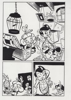
Located that Big Boy Comics sample that I did.
It's just scan of a xerox, I've no idea where the original went to.
This is okay, I think. I'd draw things a little bit differently today.
Nice spotting of blacks, though, feels nice and rich, with a bit
of depth.
Not so crazy about the way I drew the eyes.
Whatever....


4 comments:
Cool! I'm imagining big stacks of art piled up around your house, against the walls, going all the way up to the ceilings. Glad you found it!
Wow wow wow!
wow. i love this stephen. I really dig the black back wall in panel two, leaving the ceiling and side wall completely white, and then flopping the same principle in panel 3 by making the side and ceiling black. That's some serious thinking. I love that.
Glad you like, Tough Guy.
Spotting blacks is about creating a pleasing design for the page, but more importantly it's a storytelling device. Blacks should be spotted strategically, helping the readers eye to focus where you'd like them to. The black wall in panel two works because it pushes the girl, a busy little drawing, into a clear white area, while holding an extremely simplified (white) drawing of Big Boy. But, in this panel, the girl is important, she's who we're looking at. The same principal holds for the next panel, but somewhat reversed, the white holding Big Boy, who has a major area of black (his hair) spotted on him. Plus, he's got a pattern on his pants, further drawing your eye. Big Boy holds the attention in this panel.
Does that make sense?
I learned some of this shit from Bill...!
love,
Xaime DeStefano
Post a Comment